Check out EcoBlocks by clicking Here! Our Nonprofit Helping Families Make Greener Housing Choices.

Category: Uncategorized

  • Who Gets the Shade? Mapping Tree Equity in Our Cities

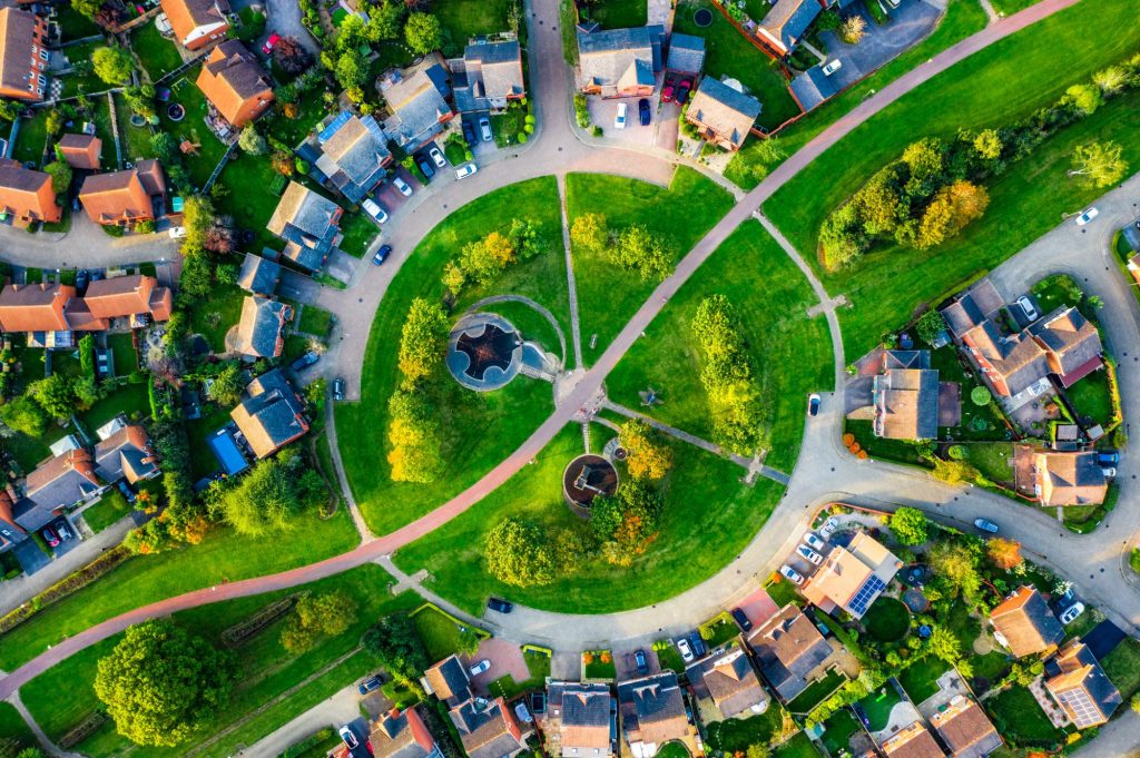
    Not all shade is created equal.

    In many cities, a quick walk through different neighborhoods reveals the story: one block is lined with lush trees, the next has barely any. It’s more than just an aesthetic difference — it’s a matter of equity, environment, and health.

    That’s where the concept of tree equity comes in. It’s the idea that every neighborhood, regardless of income or ZIP code, deserves the benefits that urban trees provide: shade, cleaner air, lower energy bills, and a cooler, more livable environment.

    At EcoBlocks, we’ve been exploring how tree canopy data reveals deeper patterns:

    🌡 Trees = Cooler Streets
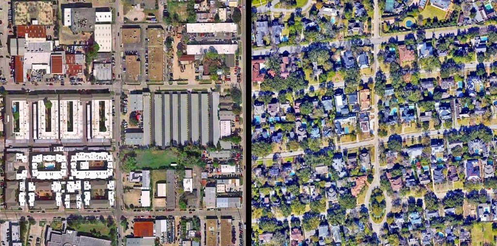
    Neighborhoods with less tree cover tend to be up to 10°F hotter during heat waves — especially in areas with high pavement and low-income housing. This isn’t random. It’s the legacy of planning decisions, redlining, and underinvestment.

    💰 Tree Canopy Follows Wealth
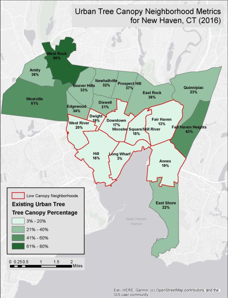
    Data shows a strong correlation between household income and tree cover. Wealthier areas often have decades-old trees and larger lots. In contrast, renters and dense developments often go without — even though they need it most.

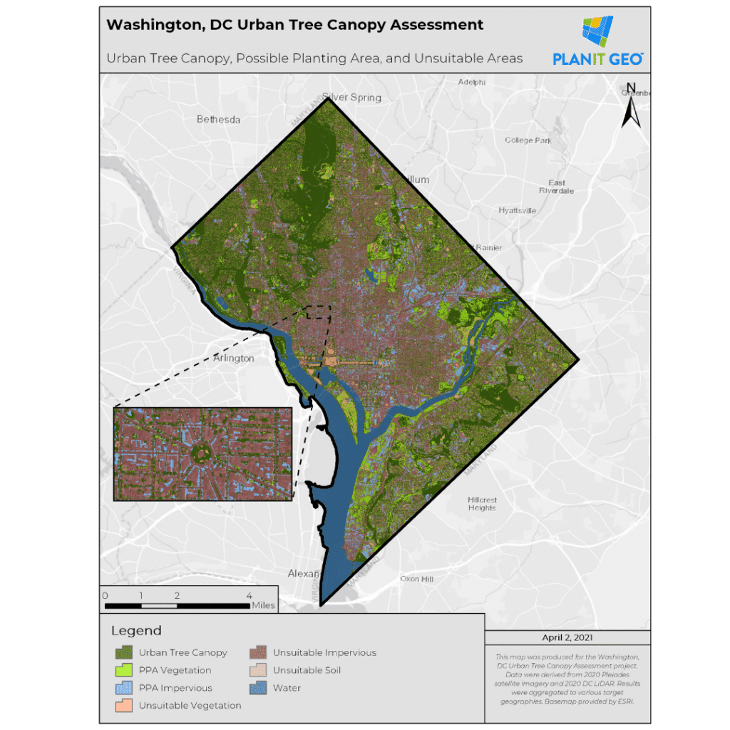
    📊 Tree Equity Scores Make It Visible
    Groups like American Forests have created tools to measure tree equity zip by zip. We’re incorporating similar metrics into EcoScore, because trees aren’t just a luxury — they’re infrastructure.

    🌿 What EcoBlocks Is Doing
    Through our Mini-Grant Green Upgrade Program, we’re helping families access funding for small but powerful changes: planting drought-tolerant trees, adding shade structures, or installing smart irrigation. These aren’t just upgrades — they’re acts of environmental justice.

    Final Thought:
    In a warming world, trees are one of the most affordable and powerful tools we have — but only if everyone has access to them. At EcoBlocks, we’re working to close that gap. Because who gets the shade shouldn’t depend on what’s in your wallet or which side of the freeway you live on.

  • Eco Upgrades That Cost Less Than a Coffee

    Sustainability can feel expensive with so many options. Electric vehicles, solar panels, high-efficiency appliances. But living more eco-consciously doesn’t always require a big budget. In fact, some of the best green upgrades cost less than your favorite coffee shop order.

    That’s the spirit behind our EcoBoost program at EcoBlocks. We offer mini-grants to help families get started with affordable, practical tools for greener living. And yes — many of them are under $10.

    Here are a few of our favorite budget-friendly upgrades anyone can try:


    🪴 1. Native Plants

    Cost: $3–$9
    Why it matters: Native plants require less water, resist pests naturally, and support local wildlife. They’re a win for both your yard and your utility bill.


    🔌 2. Smart Plugs

    Cost: $8–$10
    Why it matters: These little gadgets can help you schedule when devices turn off — cutting down on phantom energy use and giving you more control.


    💡 3. LED Bulbs

    Cost: $1–$3 each (or free from your utility provider!)
    Why it matters: They use up to 90% less energy than incandescent bulbs and last way longer. One of the easiest home upgrades you can make.


    🌿 4. Weather Stripping

    Cost: ~$5
    Why it matters: Sealing doors and windows helps your home stay cooler in summer and warmer in winter , reducing the need for AC or heating.


    🚿 5. Low-Flow Faucet Aerators

    Cost: ~$6
    Why it matters: You can reduce water waste without sacrificing pressure. Great for kitchens or bathrooms — and you won’t even notice the difference.


    Start Small. Start Smart.

    You don’t need to overhaul your entire home overnight. Real sustainability starts with the little things. If you’re part of our EcoBoost program, we’ll help you pick the upgrades that fit your space and your lifestyle — and check in to see what’s working.

    It’s not about perfection. It’s about momentum.

    What if living greener cost less than your coffee? Turns out, it can.

    Check out Eco-blocks.org some very cool stuff over there.

  • Paved Over: What Impervious Surfaces Reveal About a Neighborhood

    Most people judge a neighborhood by what’s on the surface — clean streets, nice houses, maybe a bit of green. But what’s beneath our feet often tells a more powerful story. I’m talking about impervious surfaces — the roads, rooftops, driveways, and parking lots that can’t absorb water.

    It sounds boring, but it’s not.

    Impervious surface data can reveal how a neighborhood was built, who it was built for, and how it handles stress — from floods to heat waves to housing costs.

    zoom in friendly ^^ —>>

    Here’s what I’ve learned:

    🌧️ Flood Risk Rises With Pavement
    When neighborhoods are 60–80% paved, water has nowhere to go. That leads to flash floods, sewer overflows, and damage — especially in lower-income areas that lack proper drainage infrastructure.

    🔥 More Pavement = More Heat
    Paved areas trap heat. In heat maps, you’ll often see that the hottest zip codes are also the most paved — and the least shaded. That’s no accident. These areas tend to have fewer trees, parks, and permeable surfaces.

    🚗 The Parking Lot Effect
    Large impervious areas — especially parking lots — often show up in car-centric neighborhoods with poor walkability. That has ripple effects on everything from air quality to social connection.

    📊 The Data Is There — But Hidden
    Impervious surface data exists through satellite imagery and city planning databases. But it’s rarely used in real estate tools or community planning conversations. That’s something I want to change through EcoScore and neighborhood data tools.

    Why It Matters:
    Impervious surface percentage might sound like a technical metric, but it’s actually a shortcut to understanding climate risk, walkability, and livability — all in one number.

    It’s one of those data points that quietly explains why some places feel hotter, flood more often, or feel less connected than others. And once you see it, you can’t unsee it.

  • The Hidden Cost of Noise: What Your Neighborhood’s Sound Says About Its Future

    We talk a lot about green space, transit, and walkability when it comes to livable neighborhoods. But there’s something else baked into every place we live—something you can’t always see on a map, but you definitely feel:

    Noise.

    Whether it’s the hum of a nearby freeway, planes overhead, or even a constantly barking dog, noise shapes how people experience space. And thanks to new datasets and sensors, we can finally measure it.

    When I started playing with open-source sound data from urban studies and transit departments, a few patterns stood out:

    🔊 Noise is deeply unequal
    Lower-income neighborhoods tend to be closer to highways, freight corridors, or airports. These areas often have fewer trees and less sound insulation. It’s not just annoying—it’s unhealthy. Chronic noise is linked to stress, heart disease, and poor sleep.

    🏙 Quiet ≠ Safe or Livable
    Interestingly, some of the quietest neighborhoods were also the most isolated—far from transit, amenities, or community hubs. That’s why noise should be analyzed with other data, like walkability or green space—not alone.

    💸 Sound affects value, even if people don’t talk about it
    Property values in quieter zones tend to rise faster—especially in gentrifying areas. That means noise data could be a hidden early signal for how a neighborhood might change.

    🌐 Tools are catching up
    Some cities are now building noise maps using sensors or even citizen-collected data. That’s the kind of layered info I hope to bring into tools like EcoScore—because livability isn’t just visual, it’s audible.

    We all know what it’s like to live near something loud. But until recently, noise was something we could feel but not track. That’s changing. And when we add sound to the way we analyze neighborhoods, we get a clearer, fuller picture of what it’s like to actually live there.

  • Why Rent Prices Don’t Always Make Sense — Until You Look Closer

    If you’ve ever checked rent listings and thought, “How is this place $2,400 a month?” — you’re not alone. Rents can feel random. One block is affordable, the next is double. Sometimes prices drop when you’d expect them to rise. So what’s going on?

    That question led me to dig into the data — and what I found is that rent doesn’t just follow supply and demand. It follows patterns that only make sense once you zoom in.

    Here are a few surprising factors that often shape rent:

    📍 Micro-Location:
    Forget citywide averages. A single street’s rent can shift dramatically based on whether it’s near a new coffee shop, in a better school zone, or just quieter at night.

    🌳 Green Space & Noise:
    Data from EcoScore shows that neighborhoods with more trees and parks often command higher rents — but only if the area also has good transit and low noise pollution. Nature matters, but so does convenience.

    📈 Investor Trends:
    Large investors often buy up units in “emerging” areas, sometimes raising prices before the neighborhood actually improves. The rent goes up first — livability catches up later (maybe).

    🚇 Transit Access (or lack of it):
    Places close to subways, light rail, or bus lines often have higher rents — but oddly, the biggest jumps happen not when the line opens, but when it’s announced.

    All of this is to say: rent data isn’t just about numbers — it’s about context.
    And without context, data can mislead.

    That’s why I focus so much on visuals here at The Data Lot. Maps, trend lines, and dashboards help you see how and why prices shift. They make the invisible visible.

    Because yes, rent prices can feel unpredictable. But with the right data — and the right lens — they start to make sense.

  • Why Seeing the Data Changes Everything

    Data is everywhere—charts in the news, numbers on real estate sites, maps in climate reports. But just having the data isn’t enough. If we can’t see it clearly, we can’t use it wisely.

    That’s something I learned the hard way.

    When I first started digging into housing data, I downloaded giant spreadsheets packed with numbers—average rent, commute times, air quality scores. The information was all there, but it felt…flat. Detached. It didn’t tell me anything about what it’s actually like to live in a place.

    Then I made my first map.

    It was a simple choropleth — just a color gradient showing rent prices across L.A. neighborhoods. But suddenly, something clicked. You could see the patterns — how affordability faded as you moved toward the coast, how certain pockets remained stable despite development all around them.

    THE classic “wall of numbers” view. It perfectly captures the moment when data feels sterile and hard to interpret.

    This second image displays a clean spreadsheet interface with structured columns. It’s organized clearly and could serve as a stepping stone toward more polished visualizations like charts or maps.

    I realized that when data is visualized well, it stops being abstract. It becomes personal:

    🗺 Maps show us where gaps exist — in transit, green space, walkability.
    📊 Charts reveal trends over time — like how rent hikes outpace wages.
    📌 Dashboards let people ask their own questions — not just take someone else’s answer.

    Good visuals don’t just make data pretty. They make it actionable. They spark questions, expose injustices, and give people the tools to make smarter decisions.

    Data means nothing without interpretation — but presented well, it becomes a powerful tool.

    That’s a big part of why I created EcoScore. It’s not just about ranking neighborhoods. It’s about making invisible things visible — like poor air quality near freeways, or how few trees there are in a hot neighborhood.

    Because at the end of the day, people don’t live in spreadsheets. They live in places. And when we see those places clearly, we can change them.

  • When the Data’s Not There -Build It Yourself

    I’ve always been drawn to the in-between spaces—the missing pieces in systems we rely on. In real estate, that missing piece is often livability. You can sort by price, bedrooms, maybe walkability if you’re lucky. But what about noise? Heat? Tree cover? Commute options that don’t involve sitting in traffic?

    That gap matters more than people think. A neighborhood’s green space can affect mental health. Bus stops can open up job access. Air quality impacts everything from school performance to long-term health. Yet we rarely see those layers when browsing housing listings or planning cities. The data exists, but it’s scattered—or worse, ignored.

    I’ve come to believe that if the tool you need doesn’t exist, you have two choices: wait for someone else to build it, or build it yourself.

    That’s why I started exploring how environmental and livability data could help people make smarter housing decisions. It’s not just about being eco-conscious—it’s about being realistic. Most people aren’t asking for a fully off-grid solar dome in the woods. They just want a place that’s healthier, quieter, safer. And that’s where thoughtful data can make the difference.

    The challenge is clarity. Most open data dashboards look like they were made for urban planners, not residents. I want to flip that. I want to build tools that are useful for regular people—families, renters, students—trying to choose where to live or improve where they already are.

    Because when the listings don’t tell the full story, data can help fill in the blanks. But only if we make it make sense.

  • Data Doesn’t Lie — But It Doesn’t Always Tell the Truth

    There’s a saying that “data doesn’t lie.” But after a lot of digging and research, I’ve realized something more complicated: data doesn’t lie — but it doesn’t always tell the truth either.

    Let me explain.

    I once saw a map that showed average household income by ZIP code. On the surface, it seemed like a clear story: some neighborhoods were rich, others weren’t. But then I learned that one of the wealthiest ZIP codes on the map also had a large homeless population… and another ZIP code, marked as “low income,” had more stable housing and lower eviction rates than many others. The map didn’t lie — but it also didn’t show the full picture.

    The right map shows ZIP‑level income differences, but as I learned, high‑income ZIPs can still have high homelessness or housing instability shown in the left map—meaning the picture is never quite complete.

    That’s the tricky thing about data. It’s only as good as:

    How it’s collected

    Who’s included (and who’s not)

    What’s being measured — and what’s being ignored

    In school, we often learn how to graph things or build charts. But we don’t always learn how to question the data itself. Why is this the dataset we’re using? What stories might be missing? Are we mistaking “average” for “typical”?

    That’s part of what The Data Lot is about. I’m not trying to publish perfect research papers — I’m just a student exploring how data fits into our lives. And the more I dig in, the more I realize that data isn’t just numbers or graphs. It’s a reflection of what we choose to notice… and what we don’t.

    My goal here is to share visuals and tools that help people ask better questions, not just accept simple answers. Because at the end of the day, numbers matter — but how we use them matters even more.

  • What Makes a Neighborhood ‘Sustainable’?

    We hear the word “sustainable” tossed around all the time — in politics, advertising, school campaigns. But what does it actually mean when we talk about a sustainable neighborhood?

    To me, it’s not just about whether there are a few recycling bins on the curb or a Tesla parked in someone’s driveway. Sustainability is about how a place supports both people and the planet — how it holds up environmentally, economically, and socially.

    When I first got curious about this, I started looking at cities through data. What I found was that the most livable, resilient neighborhoods often had four key ingredients:

    🌿 Green Space: Parks, trees, and open areas reduce heat, filter pollution, and create room for people to breathe. Studies even show green space improves mental health and encourages physical activity.

    🚶‍♂️ Walkability: If you can get to a grocery store, school, or park without needing a car, that’s a big deal — especially for low-income families or teens who can’t drive. Walkable neighborhoods reduce emissions and build community.

    🔌 Energy Efficiency: From insulation to smart meters to solar panels, efficient housing doesn’t just reduce emissions — it lowers energy bills and helps people stay comfortable through heat waves or cold snaps.

    🚉 Transit Access: Reliable buses, trains, and bike routes allow people to move around without relying on cars. That reduces congestion, pollution, and the cost of transportation.

    This is the kind of thinking that led me to create EcoBlocks, and why I’m building a tool called EcoScore — a free, public data tool that rates neighborhoods on these core sustainability factors. The goal isn’t to label places as “good” or “bad.” It’s to give people information — so they can make smarter, greener decisions about where and how they live.

    Not everyone can pick up and move. But everyone deserves to know how their neighborhood impacts their health, their wallet, and their future. That’s what I mean when I talk about sustainable neighborhoods.